
3TEMP - Born from engineering and shaped by culture.
On building a brewing brand without the usual tropes. Senior designer Dom Vine shares the story behind 3TEMP's new identity.
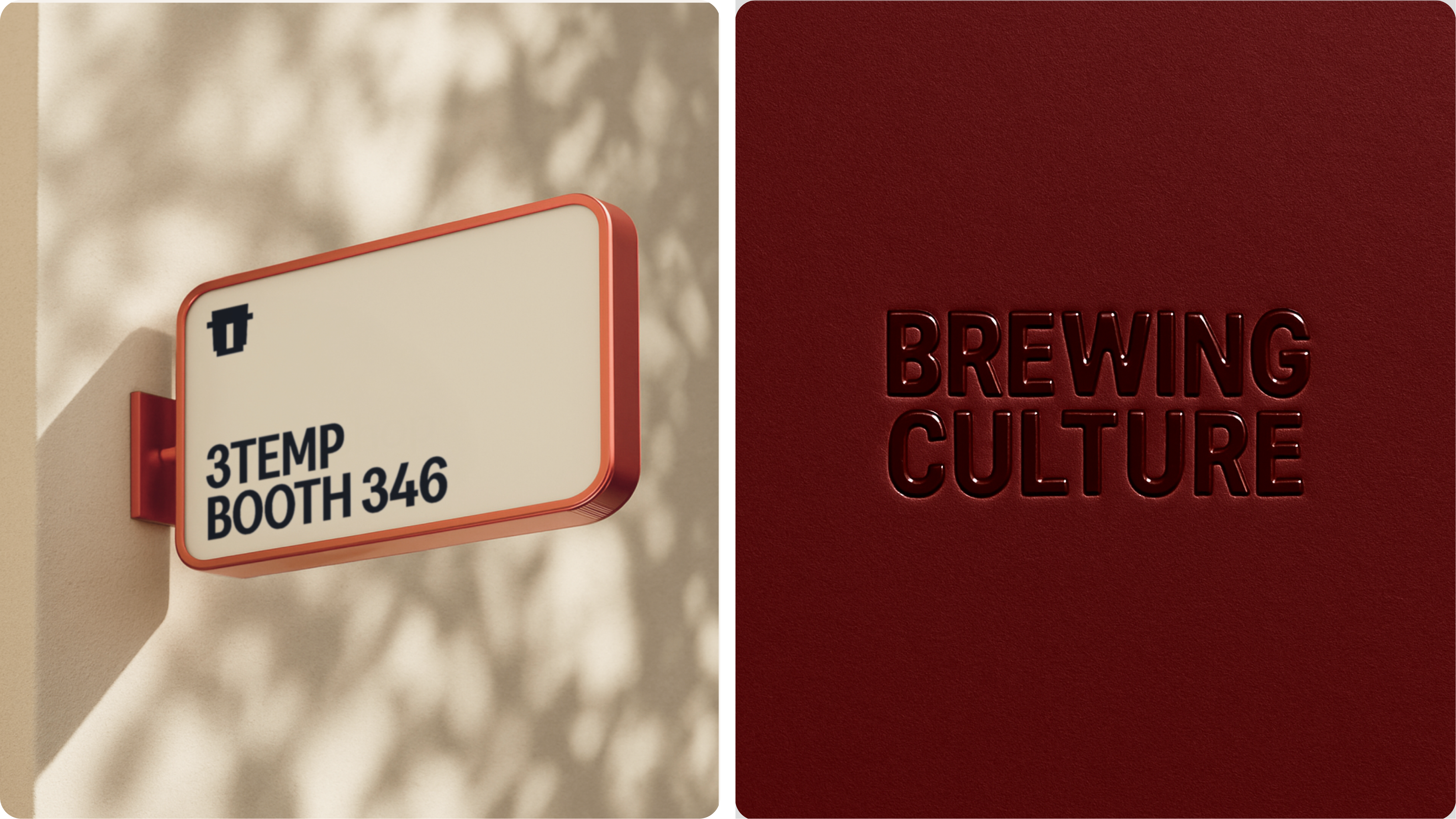
We built 3TEMP around the idea of Brewing Culture, which is the belief that brewing isn’t just a technical process, but a form of expression and identity. The challenge was grounding the identity in clean, minimal design while giving it a more global, street-smart edge that moved it beyond just being a machine and into something people connect with.
Early on, we explored much louder, more playful directions, but realised that pulling things back into something more timeless, understated and textural gave us the same youthful energy without feeling forced or ‘tropey’. The final concept expresses Brewing Culture in a confident, tactile way without feeling overworked.
Key themes for the identity were pulled directly from the client’s manifesto to help ground the brand language in what 3TEMP stands for: “bold but never loud, smart not academic, minimal not cold, direct not casual, and exacting without feeling over-engineered.”
Those ideas shaped everything, from the type and colour through to layout and materials, so the brand feels technical and performance-led, but still warm, human and culturally relevant.
The overall execution works so well because the design system mirrors how the machine itself functions – modular, precise, yet flexible enough to support creativity. Rather than creating a fixed visual style, we built a flexible framework that can shift between clean technical communication and more expressive moments. That means the brand feels just as at home on a machine or in a hospitality space as it does in social content, campaigns or collaborations.
One of the main challenges was working with 3TEMP’s existing linear logotype. The task was building a full brand world around it that felt cohesive rather than layered on. To do this, we leaned into the modular logic of the logo itself, allowing it to inform the wider system, from layout structures to typographic detailing. At the same time, we deliberately contrasted its technical precision with textural typographic choices, a rich colour palette and art direction grounded in real spaces and materials.
Overall, the system feels clean and simple at its core, but expressive and modern in use, moving 3TEMP beyond just a machine and into a brand with a clear point of view within coffee culture – one that feels genuinely distinct from its competitors.
My favourite element is how the brand expresses the machine’s linear, modular logic across the entire system in playful ways. From signage to the typographic structure and the marque, the same sense of flow and precision runs through every touchpoint. It all feels cohesive and engineered as one system, but still flexible enough to be expressive and exciting.
Ultimately, we challenged the typical language of premium coffee equipment, which often leans into heritage storytelling or ultra-minimal industrial design. Instead, we leaned into culture, storytelling and modern design language, pushing 3TEMP beyond product and into a space most brewing brands don’t explore, while still staying grounded in engineering quality.